
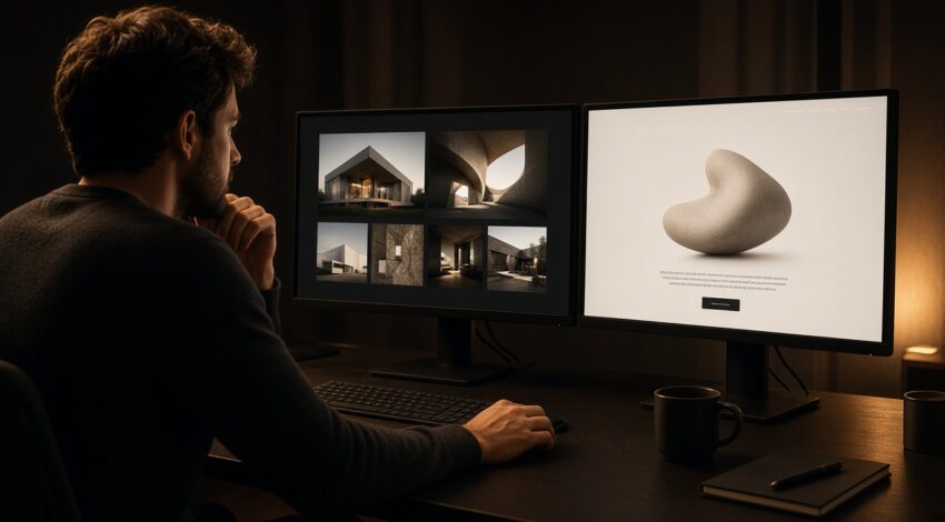
Designers want a gallery; owners want the phone to ring. Both are fair. When they compete on the same hero, both lose. The payer decides the hierarchy.
A company site
Service, proof, ask. The gallery sits one level down. “See our work” is weaker in the hero than “we can launch you this month”.
A studio site
Work leads, but every case still ends with a quote. We use the same rule on our own site: look, understand, write.
The hybrid
Home page converts; /references/ shows the work. Both sit in the menu. That structure wins service queries and “show me examples” buyers.