
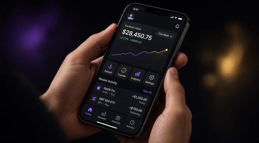
Most traffic and most decisions now happen on a phone. Mobile first is not a squeezed desktop. Design the hierarchy for a small screen first, then let the grid breathe on desktop. That is how Sby Creative still ships sites in 2026.
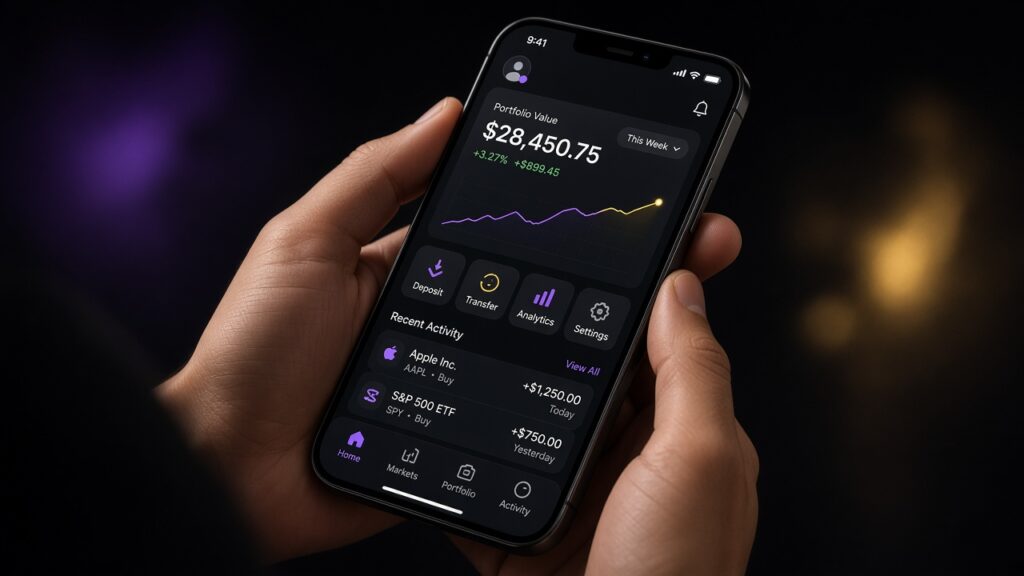
Speed is a mobile first feature
Heavy sliders, autoplay video and uncompressed heroes spend the first second. Core Web Vitals measure both rank and impatience. Serve real image sizes, lazy-load below the fold and keep the first screen quiet. Google’s Web Vitals notes are the shared target we put in proposals.
Thumb reach on a mobile first layout
Menu, WhatsApp and the quote button should be reachable with one hand. Twelve-field forms die on mobile; name, email and need are enough for most B2B sites. The language switcher is a door to a second market, not decoration. Therefore, we prototype the sticky bar before we polish desktop hover states.
If the page is fast but the ask is hidden, you still lose. See why websites get traffic but no enquiries. In addition, captions and tap targets need more than 44px; pretty type that cannot be tapped is not mobile first.
Not every brand needs an app
Many companies are cheaper and happier with a fast site than a native app. An app makes sense for loyalty, offline use or repeat tasks. We price both paths as separate options. As a result, you do not pay for stores and reviews you will not maintain.
Walk through your current phone site via the quote form.
Mobile first QA you can run in an afternoon
Open the site on a mid-range Android with the network throttled. Can you find the quote path in two taps? Does the sticky bar cover the form submit? Is the language switcher still visible when the keyboard opens? These are mobile first bugs that never appear on a 27-inch design review. We log them as blockers, not polish.
Then repeat in Safari and Chrome. Font rendering and 100vh menus still differ. A mobile first build that only ships from one browser is a desktop build in disguise. Budget that second pass in the same sprint as the visual design.