
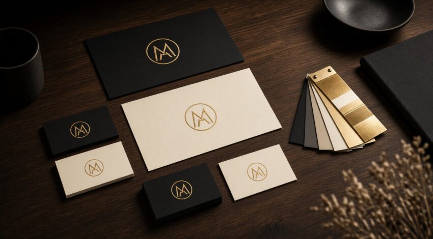
A corporate identity is not a logo file. Cards, proposals, social covers, web headers and a showreel should speak as one family. When they do not, visitors feel disorder and leave the form. Corporate identity work at Sby Creative starts with position, then the system that sales teams can actually use.
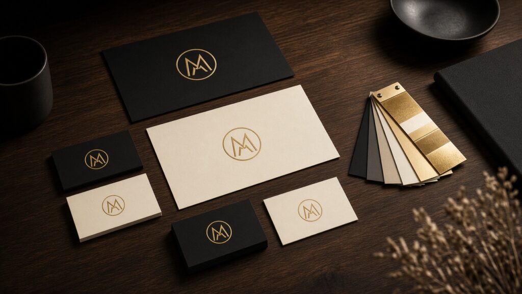
Position first, then corporate identity decoration
Who you serve and who you are expensive for must be written before colours are picked. A B2B plant and a boutique hotel can share a black-and-gold palette; type, photography and grid keep them apart. Therefore, we write a one-page brief before any mark is drawn.
For example, a factory selling spare parts needs denser type and clearer data tables than a hotel. The corporate identity still shares rules: clear space, two typefaces, a short palette, and button states the web team can copy.
A system, not a one-off logo
A useful kit includes do-nots, email signatures and form states. The web team should open it and build pages. We run identity and the site in the same sprint so the guide is not lost between vendors. In addition, we test how the English name and tagline sound out loud for global clients.
If the homepage still fights the stationery, conversion drops even when the mark looks expensive. Pair the kit with a conversion-led business website, not a gallery that hides the offer.
Every surface should sell the same line
QR on the card, a clear offer on the brochure, the same line on the site. If the message drifts, ads get more expensive and memory drops. As a result, brand film and print should reuse the same three claims. When you are ready to refresh or start from zero, read how we work or contact us.
Corporate identity pitfalls we still see
The most expensive corporate identity mistake is a mark that cannot live on a form button or a 16-pixel favicon. Test the logo at those sizes before you print foil. Another pitfall is a palette that fails contrast on mobile; conversion then drops even if the brand book looks premium. We therefore check WCAG contrast on primary buttons as part of the identity sprint, not as a later accessibility ticket.
Keep the verbal identity as tight as the visual one. Three claims, one tone of voice, a banned-words list. When sales and the website share that list, the corporate identity finally behaves like a system rather than a PDF on a shared drive.